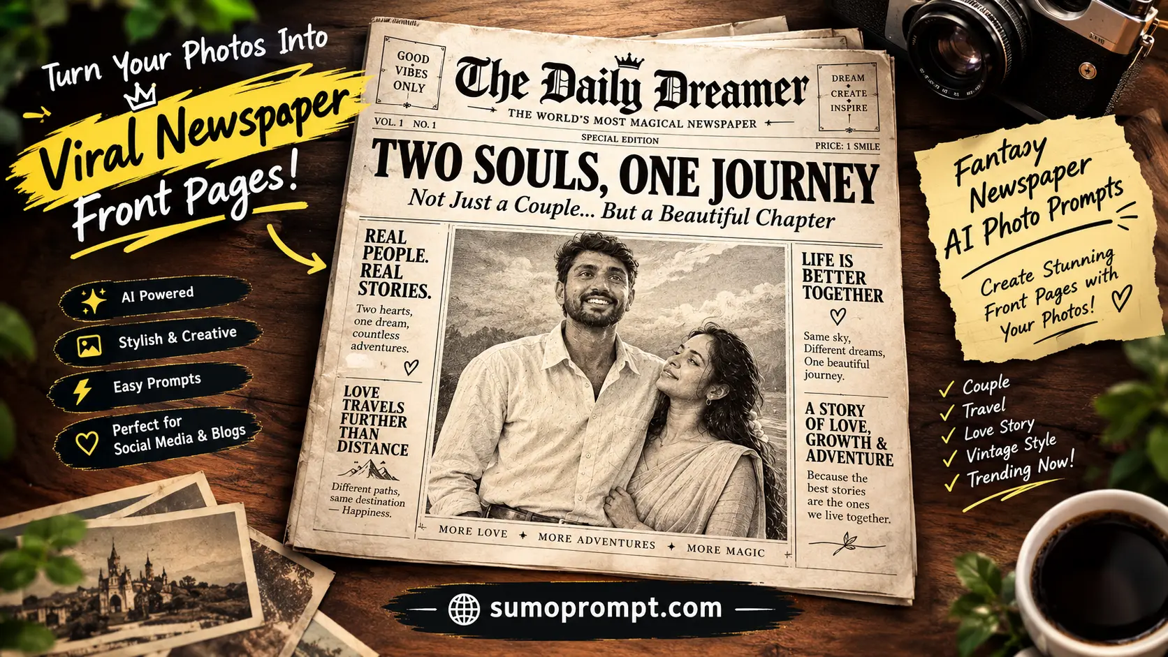
You’ve seen the ones where somebody’s face appears as an old engraved portrait on the front page of a newspaper, surrounded by dense columns and a giant absurd headline announcing something that never happened. It’s one of the most shareable AI edits going, because the picture isn’t the joke — the headline is.
Which is exactly why most attempts fall flat. People paste a prompt, let the AI invent the headline, and get back something generic like “LOCAL RESIDENT SEEN SMILING”. Technically correct, completely unfunny.
The fantasy newspaper prompt works differently from every other trend. Write your headline first, then build the prompt around it. This guide covers that, plus the text-rendering problem that makes newspaper edits harder than any other style — and how to get around it.
Fantasy Newspaper AI Photo Prompts – Overview
| Detail | Information |
|---|---|
| Style | Vintage newspaper front page with your portrait |
| Tools | ChatGPT or Gemini (Nano Banana) |
| Input | One clear photo, front-facing |
| Output Ratio | 4:5 vertical or 3:4 |
| Difficulty | Medium — text rendering is the hard part |
| Best For | Birthdays, achievements, jokes, couple announcements |
Write Your Headline Before You Write the Prompt
This is the step that decides everything. Spend two minutes here and the rest is easy.
Keep it under eight words. Long headlines come back garbled, cut off, or misspelled. Short ones render cleanly. This is a technical limit as much as a creative one.
Make it absurd but specific. “MAN DOES SOMETHING AMAZING” is nothing. “LOCAL MAN DEFEATS ENTIRE FAMILY AT LUDO” is a post people tag someone in. Specificity is where the comedy lives.
Four headline formulas that work:
The exaggerated ordinary — take something small and report it as national news. “CITY MAN FINALLY REPLIES TO GROUP CHAT.”
The fake achievement — award yourself something ridiculous. “SCIENTISTS CONFIRM: HE IS ALWAYS LATE.”
The mock scandal — harmless accusations, played straight. “SUSPECT SEEN EATING LAST SAMOSA.”
The genuine announcement — for birthdays, engagements, results. “SHE SAID YES” or “TWENTY-FIVE YEARS OF TROUBLE.” These are the ones that actually get sent to family groups.
Write your headline now. Everything below has a slot for it.
The Classic Fantasy Newspaper Front Page
The base prompt. Paste your headline where marked.
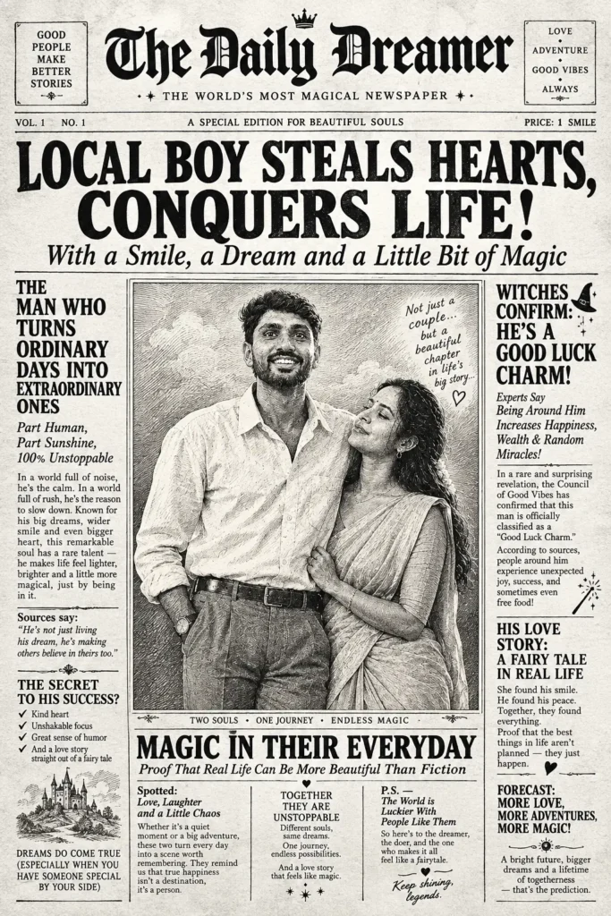
Transform the person in the uploaded photo into the main portrait on a whimsical black-and-white vintage newspaper front page.

IDENTITY:
Keep the face clearly recognisable as the person in the reference photo — preserve the same facial features, expression, hairstyle, face shape, and overall identity. Do not age the person, slim the face, reshape facial features, or change their identity.

Convert the portrait into the visual style of an old engraved newspaper illustration using extremely fine crosshatching, detailed linework, subtle halftone dots, and traditional print textures while keeping the person's real appearance recognisable.

LAYOUT:
Place the main portrait prominently in the centre of the newspaper page.

Above the portrait, add one large bold classic serif headline reading exactly:

[YOUR HEADLINE HERE]

Below the portrait, include a small elegant italic caption line.

Surround the main portrait with dense, narrow newspaper columns containing small body text. The text should be intentionally unreadable and softly blurred, creating the authentic appearance of printed newspaper copy without forming readable words or sentences.

MASTHEAD:
Add an invented newspaper name across the very top of the page in ornate vintage serif typography. Place a decorative horizontal rule beneath the masthead along with a fictional newspaper date.

STYLE:
Classic black-and-white vintage newspaper aesthetic.
High-contrast black ink printed on warm off-white aged paper.
Fine engraved illustration details, crosshatching, halftone dots, subtle paper grain, visible paper fibres, slight ink bleed, and very subtle print misalignment.

The page should feel like an authentic old newspaper discovered in an archive, with traditional editorial composition and classic serif typography throughout.

FINISH:
Make the entire composition look like a real printed newspaper page photographed flat from above.

Slightly yellowed and aged paper appearance.
Natural vintage imperfections.
No colour.
No glossy surfaces.
No modern graphic design.
No modern UI elements.
No contemporary fonts.

OUTPUT:
4:5 vertical composition.
High resolution.
Extremely detailed.
Professional editorial-quality vintage newspaper print.
Preserve the person's identity and facial recognisability above everything else.

NEGATIVE PROMPT:
Do not change identity, facial structure, hairstyle, expression, age, or skin characteristics. No face distortion, no extra facial features, no duplicate face, no cartoon face, no modern typography, no colourful elements, no glossy paper, no plastic texture, no futuristic design, no readable fake newspaper paragraphs, no watermark, no unnecessary objects.
The key line is the unreadable body text. That single instruction prevents the most common failure — the AI filling every column with garbled nonsense letters that ruin the whole image.
The 1920s Tabloid Sensation
Louder, denser, and the most fun to read. Works best with a mock-scandal headline.
Transform the uploaded photo into the front page of a sensational 1920s tabloid newspaper.

IDENTITY:
Keep the person's face clearly recognisable and faithful to the uploaded reference photo. Preserve the original facial structure, face shape, expression, hairstyle, and identity. Render the portrait as a grainy vintage halftone news photograph with clearly visible printing dots and authentic newspaper texture.

Do not reshape the face, change facial proportions, age the person, beautify the features, slim the face, or alter their identity.

LAYOUT:
Create a dramatic 1920s tabloid newspaper front page.

Across the full width of the page, place one huge screaming headline in heavy condensed vintage serif capitals reading exactly:

[YOUR HEADLINE HERE]

Beneath the main headline, add two smaller italic subheadings with an authentic sensational newspaper feel.

Place the main portrait prominently on one side of the page with a vintage boxed caption underneath or beside it.

Fill the remaining space with multiple dense narrow newspaper columns containing intentionally unreadable and softly blurred text. The columns should look like genuine old newspaper body copy without forming clearly readable sentences.

DETAIL:
Add a small decorative vintage border around the page.

Include a newspaper price and fictional date in one corner.

At the very top, create an invented newspaper name in bold, heavy blackletter typography.

Use authentic 1920s tabloid editorial composition, strong visual hierarchy, uneven spacing, and old-fashioned print proportions.

STYLE:
Heavy black ink printed on cheap yellowed newsprint.

Visible halftone dot patterns across the portrait and printed areas.
Uneven ink coverage.
Slight ink smudging and imperfect registration.
Subtle paper creases, worn edges, tiny imperfections, and natural aging.
Authentic vintage newspaper grain and fibre texture.

The overall appearance should feel dramatic, raw, sensational, and historically inspired by a 1920s tabloid newspaper.

FINISH:
Make it look like a genuine old tabloid front page photographed flat on a wooden table.

Add subtle aging, faded paper, worn corners, slight shadows, and a torn lower corner.

No colour.
No glossy surfaces.
No clean modern typography.
No modern graphic design.
No digital UI elements.

OUTPUT:
4:5 vertical composition.
High resolution.
Extremely detailed vintage print texture.
Professional editorial-quality newspaper design.

NEGATIVE PROMPT:
Do not change the person's identity, facial structure, hairstyle, expression, or age. No face reshaping, no beautification, no modern typography, no colourful elements, no glossy paper, no futuristic design, no clean digital layout, no readable fake newspaper paragraphs, no duplicate face, no distorted facial features, no watermark.
The Sports Back Page
A completely different feel, and nobody in this trend is doing it. Great for gym posts, cricket jokes and anything competitive.
Transform the uploaded photo into the main image on a vintage newspaper sports page.

IDENTITY:
Keep the person's face clearly recognisable and faithful to the uploaded reference photo. Preserve the original facial structure, face shape, hairstyle, expression, and identity.

Render the person as a grainy black-and-white action press photograph with authentic film grain, visible halftone printing dots, strong newspaper texture, and realistic vintage photographic detail.

Do not reshape the face, change facial proportions, beautify the features, age the person, or alter their identity.

SCENE:
Show the person naturally captured mid-action during an intense sporting moment.

Use a dramatic low-angle perspective similar to a professional sports press photographer positioned close to the action. Create a realistic sense of movement, energy, and authentic newspaper sports photography.

Preserve the person's recognisable appearance while adapting the scene into a classic vintage sports photograph.

LAYOUT:
Create a realistic old newspaper sports page.

Across the top, place one bold headline in condensed classic serif capitals reading exactly:

[YOUR HEADLINE HERE]

Place a small vintage caption directly beneath the main photograph.

Surround the main sports photograph with narrow newspaper columns containing intentionally unreadable and softly blurred text.

Add a small vintage sports results table nearby, with blurred and unreadable entries that visually resemble historical match results or scores.

Use authentic newspaper editorial spacing, strong black-and-white contrast, traditional print hierarchy, and slightly imperfect alignment.

STYLE:
Classic black-and-white vintage sports newspaper aesthetic.

Heavy black ink on slightly yellowed newsprint.
Strong contrast.
Visible halftone dot patterns.
Fine film grain.
Uneven ink coverage.
Subtle ink smudging.
Slight print-registration imperfections.
Natural paper fibres and aged newspaper texture.

The photograph should have the dramatic visual character of a decades-old sports press image while remaining realistic.

FINISH:
Make the complete composition look like a genuine vintage sports newspaper page photographed flat on a table.

Add subtle paper aging, tiny creases, faded areas, worn edges, and authentic printing imperfections.

No colour.
No glossy surfaces.
No modern graphics.
No modern UI elements.
No contemporary design language.

OUTPUT:
4:5 vertical composition.
High resolution.
Extremely detailed.
Professional editorial-quality vintage sports newspaper design.

NEGATIVE PROMPT:
Do not change identity, facial structure, hairstyle, expression, or age. No face distortion, no beautification, no modern typography, no colour, no glossy effects, no futuristic graphics, no clean digital layout, no readable fake newspaper text, no duplicate person, no distorted anatomy, no watermark.
The Special Edition (Birthday, Wedding, Results)
The one people actually send to their families. Warmer, less absurd, and the version most likely to get saved rather than just liked.
Transform the uploaded photo into a commemorative vintage newspaper special edition front page.

IDENTITY:
Keep the person's face clearly recognisable and faithful to the uploaded reference photo. Preserve the original facial features, face shape, hairstyle, expression, and identity.

Render the portrait as a warm sepia-toned halftone newspaper photograph with fine print texture, subtle crosshatching, delicate printing dots, and authentic vintage photographic detail.

Do not alter the facial structure, expression, age, or identity. No reshaping, slimming, beautification, or facial modifications.

LAYOUT:
Create an elegant commemorative vintage newspaper special edition.

At the very top, place an ornate masthead featuring an invented newspaper name in classic Victorian-inspired typography.

Surround the page with a refined decorative vintage border featuring subtle ornamental flourishes.

Add one large elegant headline in classic serif capitals reading exactly:

[YOUR HEADLINE HERE]

Directly beneath the headline, add a formal date line reading exactly:

[YOUR DATE]

Place the main portrait prominently on the page and frame it with a thin decorative ornamental border.

Surround the portrait with multiple narrow newspaper columns containing small body text that is deliberately unreadable and softly blurred, creating the authentic appearance of an old printed newspaper without generating readable paragraphs.

STYLE:
Warm cream-colored aged paper with clearly visible natural fibre texture.

Use sepia and dark brown ink throughout the page.

Elegant Victorian-style serif typography.
Ornate typographic flourishes.
Fine halftone dots.
Subtle engraved-print texture.
Slightly uneven ink coverage.
Gentle paper fading and natural print imperfections.

The overall design should feel dignified, nostalgic, elegant, and commemorative rather than sensational.

FINISH:
Make the page look like a genuine keepsake newspaper edition that has been carefully preserved inside a picture frame for decades.

Add soft warm fading, subtle age marks, delicate worn edges, faint paper creases, and naturally aged paper texture.

The final result should feel authentic, timeless, sentimental, and slightly faded while maintaining a premium editorial appearance.

No modern graphics.
No modern UI elements.
No glossy surfaces.
No bright colours.
No contemporary typography.

OUTPUT:
4:5 vertical composition.
High resolution.
Extremely detailed.
Professional vintage newspaper editorial quality.

NEGATIVE PROMPT:
Do not change identity, facial structure, hairstyle, expression, or age. No face distortion, no excessive beautification, no modern typography, no bright colours, no glossy effects, no futuristic design, no clean modern layout, no readable fake newspaper paragraphs, no duplicate face, no distorted anatomy, no watermark.
Getting the Text to Come Out Readable
Newspaper prompts are the hardest text-heavy category in AI image generation, and almost every failed attempt fails here. Five rules fix most of it.
Give the exact text, marked as exact. Write “reading exactly:” before your headline. Without that, the model treats your headline as a theme and invents its own version of it.
Limit yourself to one or two readable text elements. A headline and maybe a date. Every additional piece of text you ask for readable multiplies the chance of garbled output somewhere on the page.
Explicitly ask for the rest to be unreadable. This sounds backwards but it’s the single most useful instruction in the whole prompt. “Deliberately unreadable and blurred” tells the model to render texture rather than attempt words it will get wrong.
Use capitals for headlines. Models render uppercase serif text far more reliably than mixed case at small sizes.
Invent the newspaper name. Don’t ask for a real paper’s masthead — you’ll get a distorted version of a trademarked logo, which is both a worse image and a problem if you’re posting it anywhere public. Make one up. “THE DAILY CHRONICLE”, “THE EVENING HERALD”, something generic-sounding. It looks more authentic anyway.
When It Doesn’t Work
The headline is misspelled. Shorten it. Every word past about six is a risk. If a specific word keeps failing, swap it for a shorter synonym.
Every column is filled with nonsense letters. You didn’t ask for unreadable body text. Add that line and regenerate.
The face isn’t recognisable. The engraved and halftone styles stylise heavily, which is the point — but if it’s gone too far, add “keep the facial likeness clearly recognisable despite the print styling” and reduce how much texture you’re asking for.
It looks like a modern poster, not a newspaper. You’re missing the paper. Add ink bleed, halftone dots, print misalignment, paper fibre texture and slight yellowing. The imperfections are what make it read as printed.
The layout is too clean. Real newspapers are dense and slightly chaotic. Ask for narrow columns, tight spacing and a crowded page rather than generous white space.
The date or caption came out wrong. Same fix as the headline — mark it “reading exactly” and keep it short.
Frequently Asked Questions
Does this work on the free version? Yes, on both ChatGPT and Gemini. Free tiers limit daily generations and sometimes resolution, which matters here because text needs detail to stay sharp.
Which tool handles the text better? ChatGPT generally renders typography more reliably. Gemini holds facial likeness better. For this trend, typography usually matters more, so start with ChatGPT.
Why does my headline keep coming out wrong? It’s too long, or you didn’t specify it as exact text. Keep it under eight words and write “reading exactly:” before it.
Can I use a real newspaper’s name? Don’t. You’ll get a distorted trademarked logo, and it’s not worth the trouble if you’re posting publicly. Invented mastheads look more authentic anyway.
Can I do this with a couple or group photo? Yes. Add a line stating that each person’s face must match their own reference and must not be blended together.
What’s the best use for this trend? Birthdays, anniversaries, exam results and engagement announcements. The joke versions do well too, but the commemorative ones get saved and reshared far more.
Conclusion
Everything about this trend rests on eight words. Get the headline right and even a rough render will land; get it wrong and the most beautifully textured newspaper page in the world still won’t be funny.
Write your headline first, keep it short, mark it as exact text, and let every other word on the page be deliberately unreadable. That last rule alone will fix most of what goes wrong.